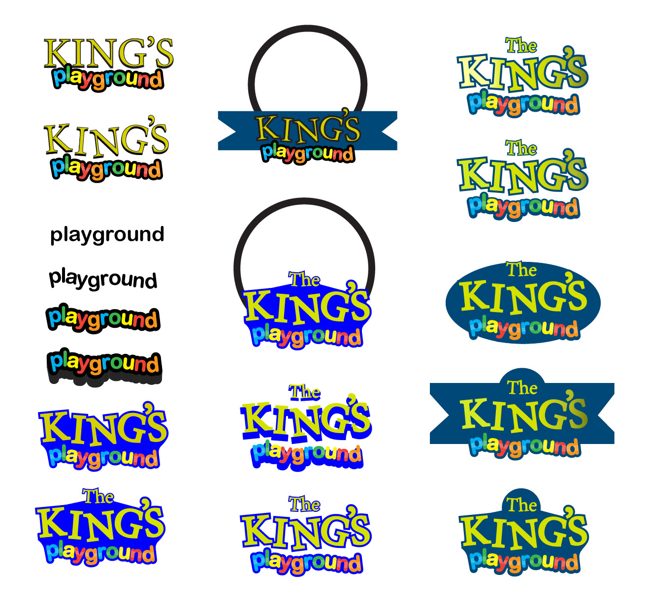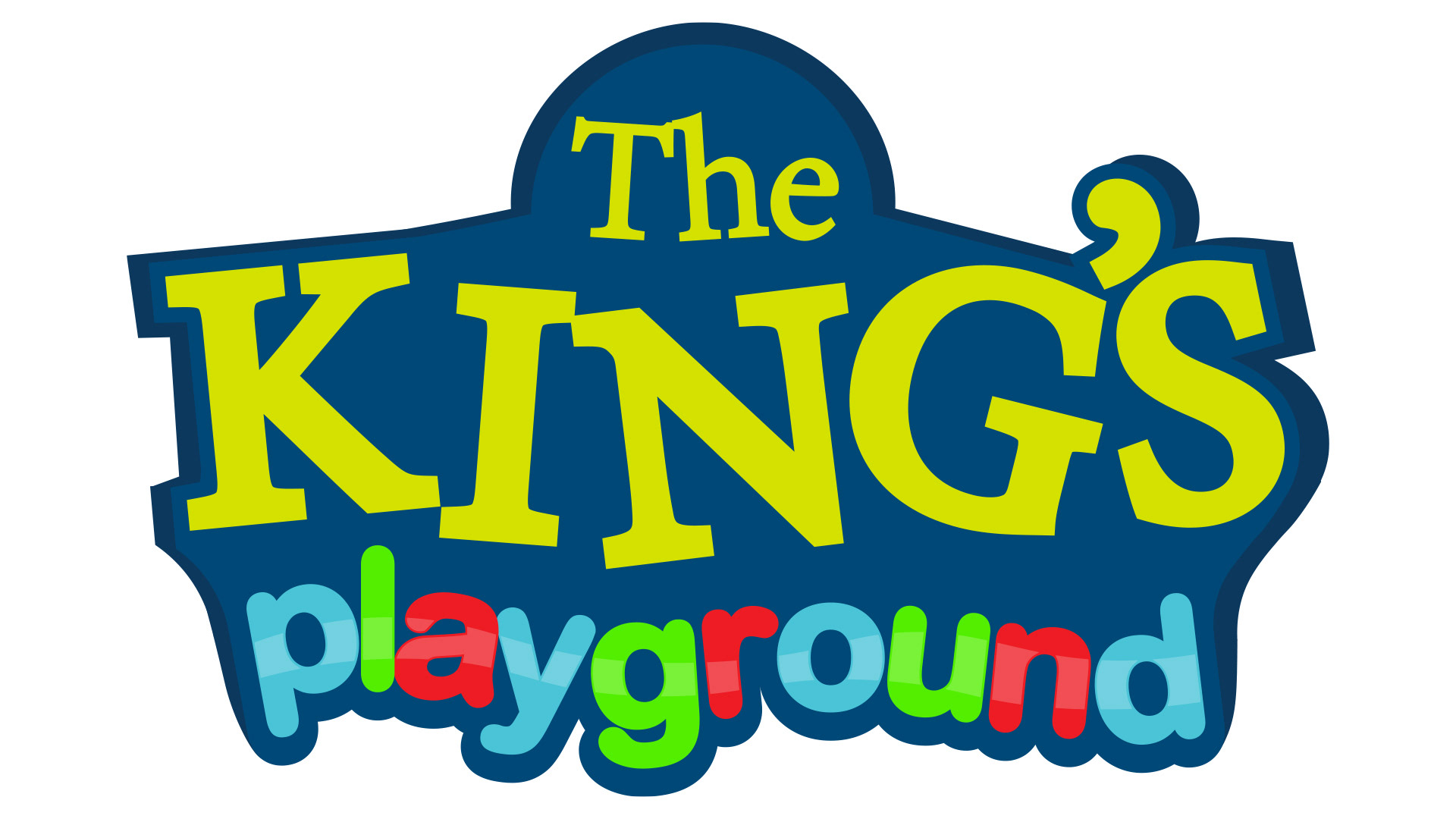
The logo that I designed for my pre-production project on my series The King's Playground. This logo effectively shows the contrast between a bold and dramatic serif font conveying royalty and pride and a playful sans serif font to emphasise the childish nature and environment that the show takes place in.
My final design consists of dominant blue and gold colours to evoke the feeling of a kingdom, but I also wanted it to feel like you were in a school. The dome shape at the top is meant to resemble that of a clock that schools have in outside and in classrooms.